Switching to Blender #1
Categories:
[art]
Tags:
[3d graphics],
[blender]
I'm getting started with Blender coming from 3dsMax a long time ago. Join me in this adventure as I post my thoughts and findings along the way.
Summary So far the application is quite different than anything I've used before. It needs a UI refresh (I know about the drama), but I think it's worth learning after my first experience. I give it an "unexpectedly nice" out of 5 stars.
Existing Beliefs
I've been doing 3d graphics since about 2006 when I started fooling around with bootleg versions of Bryce and Poser for school projects. From there I played with Planetside's Terragen, E-On's Vue d'Esprit, and eventually landing on 3dsMax as my long-term 3d platform of choice. I did a YouTube show for a while and made a website trying to help others make sense of this software package.
Basically I'm coming in knowning 3D but not knowing Blender.
Over the last two years, though, I haven't done much in the way of computer graphics. Maybe I just got busy or maybe I have a career now that isn't in 3d graphics. The core fact is that it just hasn't been as big a part of my life.
And I've gotten rusty. Really rusty.
So that precipitated my decision to look at other software. That, and 3dsMax is about $150/month for a license unless I want to continue being an educator and something about that rubs me the wrong way. Even [Modo] costs just $15/month! And it's not about the money either; it's about accessibility. I want to use something that I can always count on as a platform. I'm not beholden to the ups and downs of a company. Buyouts and sales can do some serious damage to a community, and I think Blender's going to be somewhat immune to that kind of problem.
Plus I want to do something for the FOSS community, and using open software is the first step toward contributing.
I'd dismissed Blender before because I heard it was batshit crazy. I've been told it's heavily keyboard based, has limited modeling tools, and does this differently than every other package. It's time to start testing these assumptions.
First Impressions
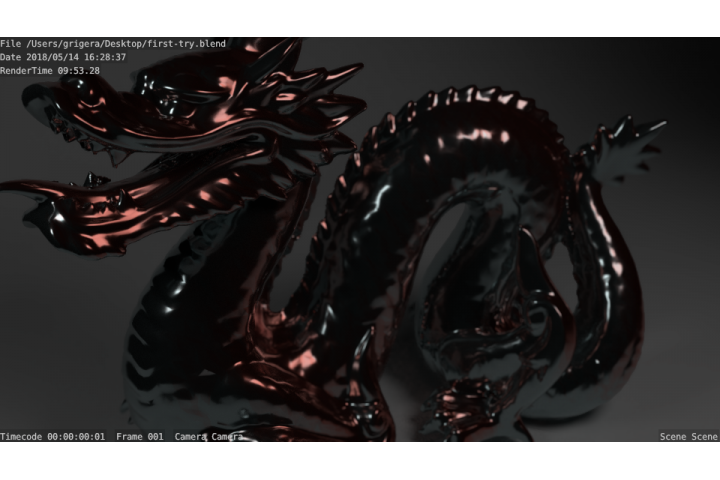
Let's start with some good things. Overall I was impressed with Blender and I'm looking forward to future sessions. I jumped in and went straight for Cycles rendering since I've found it can be the easiest thing to get into. Pick some materials and hit render.

Not too bad for fooling around for 3 or 4 hours on a Saturday. Working with imported models helped a lot.
As directly as I can say it, a lot of the rumors were true. Blender really doesn't do things like other applications, and not always in a charming, "Oh what a novel approach" kind of way, but in a "lol are you serious?" kind of way.
Have you ever heard that song "One piece at a time" by Johnny Cash? It feels like that sometimes. Like it was built one piece at a time so some of it is predicated on very old conventions (modeling tools in the left pane are a flat, seemingly unsorted list) while some elements use modern practices (sculpting tools). I've found myself several times wondering where a basic function can be found only to learn that its buried somewhere or best available through a hotkey.
The Interface
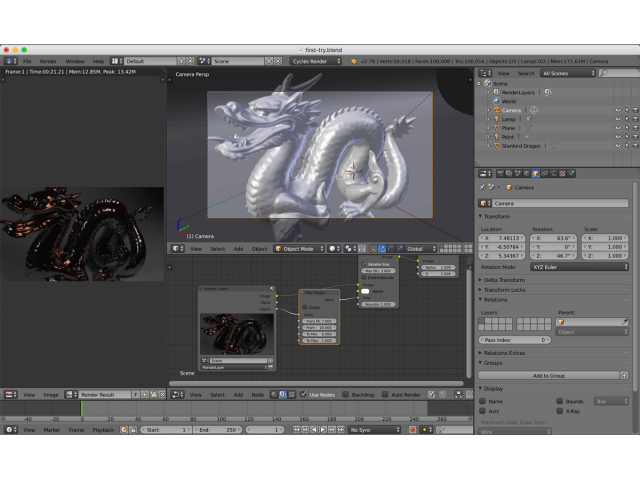
I love the idea of having a fluid windowed interface. It works well for power users like me that often want to customize what we're looking at on-the-fly. In 3dsMax you're dealing with modal dialogs that present controls while you observe those changes in preview windows or the viewports behind what you're looking at. In this case you can basically ask Blender to show you a rendered version of your scene alongside your perspective viewport.
I see it also goes beyond that. e.g. I can have a dope sheet or a node editor alongside a preview and a tiny camera view in the corner to thumbnail it out. That was one of my favorite features of Vue d'Esprit, so it's a welcome feature.
I'm really enjoying how easy it is to get some previously difficult effects.

That said, I struggled with the interface at times. I have no idea how to see how many materials I created in this scene or how to edit them without selecting an object that uses it. The node editor has some context sensitivity to it that I couldn't figure out, so half the time I was trying to find how to add nodes and wondering why the menus changed out from under me.
There is one-sentence help information available on hover help on most elements, but the sentence is painfully short of real information. ZBrush handled this like a champ in 2010 when you could hold alt and see overlayed shortcuts, descriptions, and even little previews of what interface items do.
The Keyboard
This feels like it follows vim philosophy. I've been getting into Linux these last couple years and this feels like a natural extension of the patterns and philosophies that dominate that space. Everything indeed has a shortcut and playing with some of the basics like grab-z and rotate-y were lovely. I'm sure it's possible to do in 3dsMax but trying it out here feels native.
Most importantly I think this means there's a lot of headroom for memorizing hotkeys to speed up workflows.
I think this phiolsophy backfired sometimes, though. For example, using extrude or bevel tools mean that when you click the UI element, it goes into effect immediately regardless of where your cursor is. In a sense, it's less like you're picking up and putting down tools, so much as you're invoking hotkeys when you click the cursor on something. It's not wrong, but it's a disorienting experience when you're in a visual UX using a cursor.
The Community
Open source means we're all in this together. There's something special at work in Blender that I don't think I've see as much in 3dsMax. Maybe it's the open source nature of the project that means everyone can see what's being developed. This collaborative spirit is really inspiring! When everyone can participate, we're more likely to see meaningful improvements that match what the community wants and needs (rather than what might be the most profitable, which aren't always the same).
I saw Andrew's work and I can't over-state how important it is to have someone championing the cause the way he does. Showing off good work, propagating best practices, and leading UX improvements (even if it steps on toes) are super important. If for no other reason than it brings people in by saying "This software can deliver the same results as the brand-name packages." Kudos to him and everyone else championing the cause!
But, as I use Blender, I can feel certain parts where it's clear that the "new and shiny" got a lot of love, but potentially older or fringe elements might not get as much attention. For example, Ambient Occlusion feels like a second-class citizen in Blender. In 3dsMax it is treated as a Map (a color in Blender parlance, but with many more options in the node). In Max AO results can be affected by any nearby object; it's the renderer's job to generate that material so it's object-agnostic. In Blender- however- it's localized to the object and it sounds like it is, at least conceptually, highly coupled with the idea of lighting. That's limiting for dirt masking and procedural texturing and I'm a big fan of both of those things.
And, before you say it, no I'm not going to bake it down to a texture map. That's not for procedural texturing because then it's not procedural anymore. ;)
So again, overall, I'm looking forward to using Blender more and getting to know it's particular brand of crazy. In the long run, I see myself being a supporter of a simpler UX with deeper (and better thought-out) nesting of functionality to unfold the user experience better.
P.S. I tip my hat to whomever set up the 3dsMax hotkey scheme. Switching to that made everything feel a little more familiar!